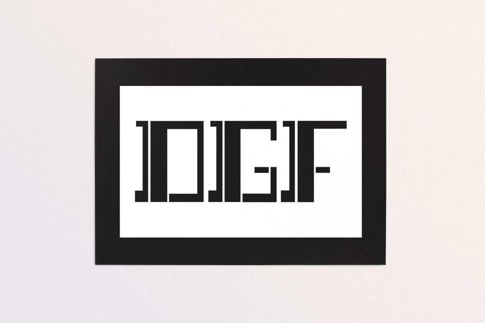
Bitmap Monogram

Artist Statement
The intention behind the typeface was to create a boxy serif with consistent line widths and tapers. Starting with the overall rectangular shape, the stroke of the lines was adjusted depending on the direction, whether that be vertical or horizontal. Tapers were added in appropriate spots to help contribute to the distinction of the letterforms. Some areas were left disconnected such as the crossbar of the “G” and the “F”. This was to add a distinctive characteristic to the typeface without overcomplicating it. Additionally, to characterize the typeface, the vertical bar that is attached to the decorative tapers, is also separated from the overall letterform.

