Magazine Spread Reboot

Artist statement
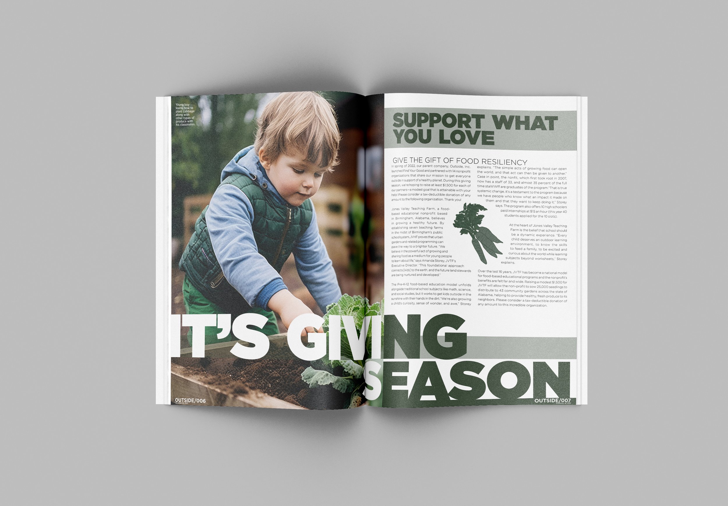
The Magazine Reboot project started with creating a grid that would successfully contribute to the design of the magazine and would fit the required content of the article given. Each part of the layout and grid not only helped contribute to different levels of hierarchy, but also to successfully break up the different pieces of information such as the title, the sidebar, the imagery, and the body copy. This specific image was chosen because it showcases what the article is about, which is the importance of integrating gardening and the knowledge of food into educational systems. The green monochromatic color palette was inspired by the colors found in the image. The colors are kept simple so that it wouldn’t take away from the article itself, more so just to tie it all together. The typeface “Gotham Ultra” was chosen for the title and headings and “Gotham” for the body. Gotham is a very clean and easily legible font which gives the overall magazine a clean and sleek. Finally, the folio was crafted using the same fonts along with a green color bar that ties in the opaque color bar behind the title of the article.

