Album Cover 224

Artist Statement
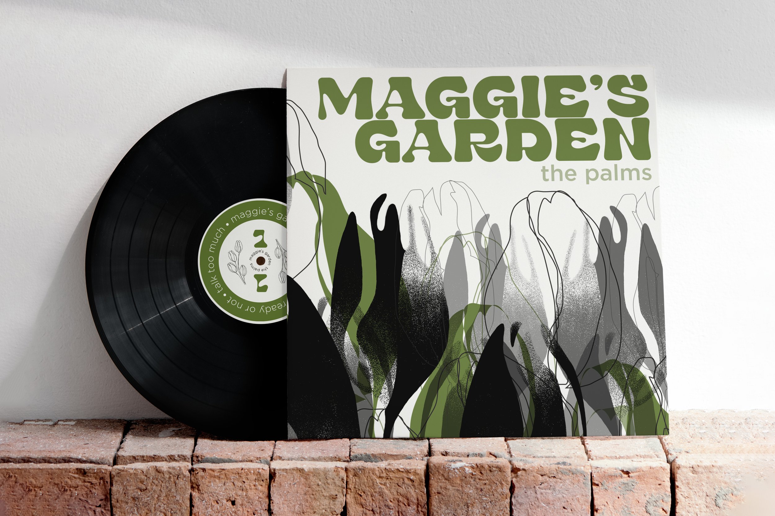
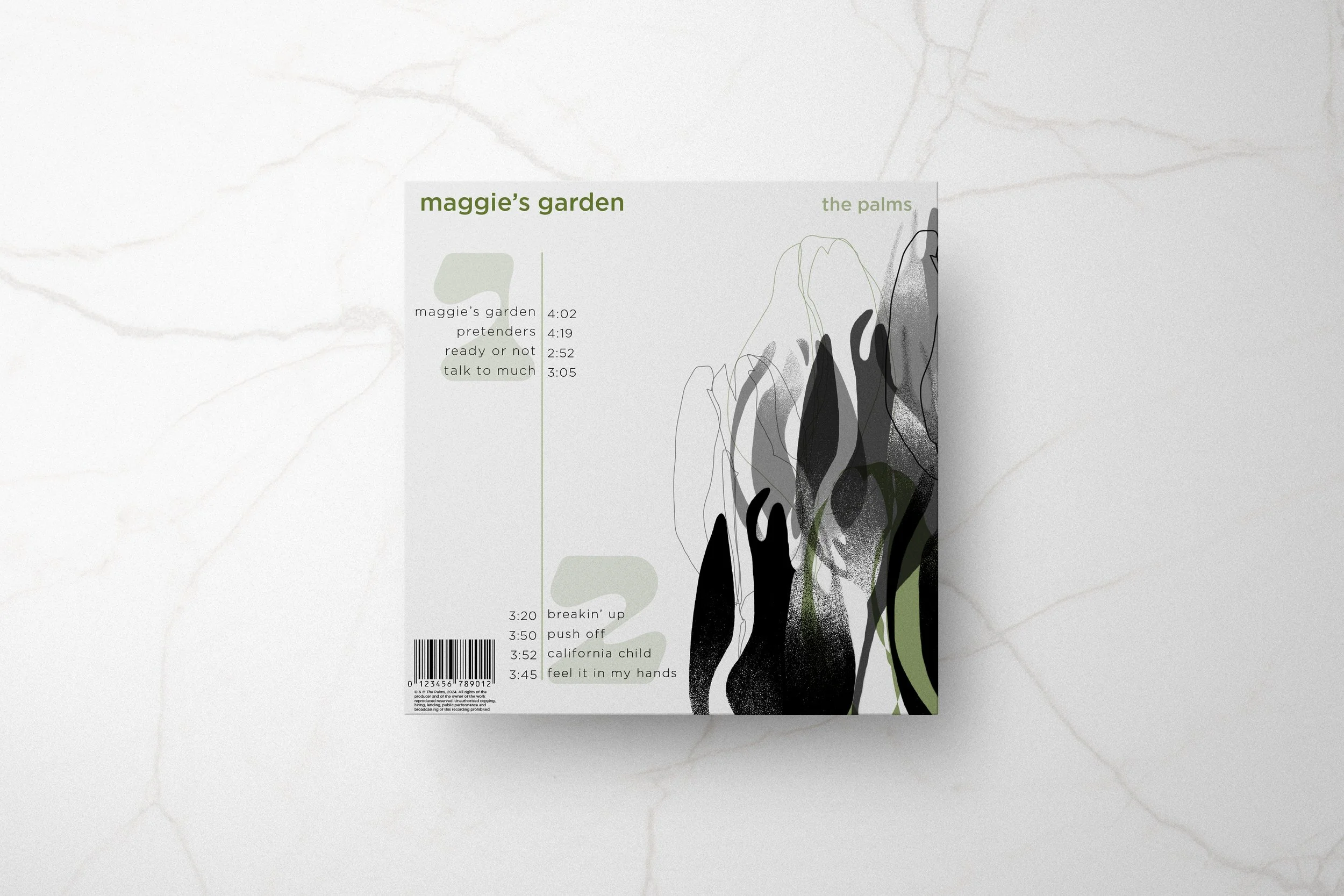
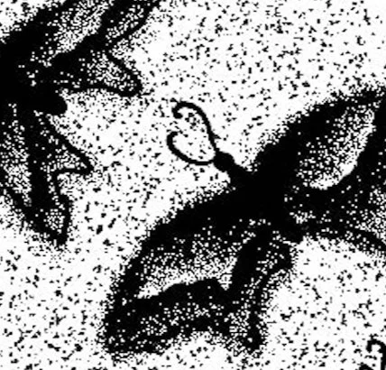
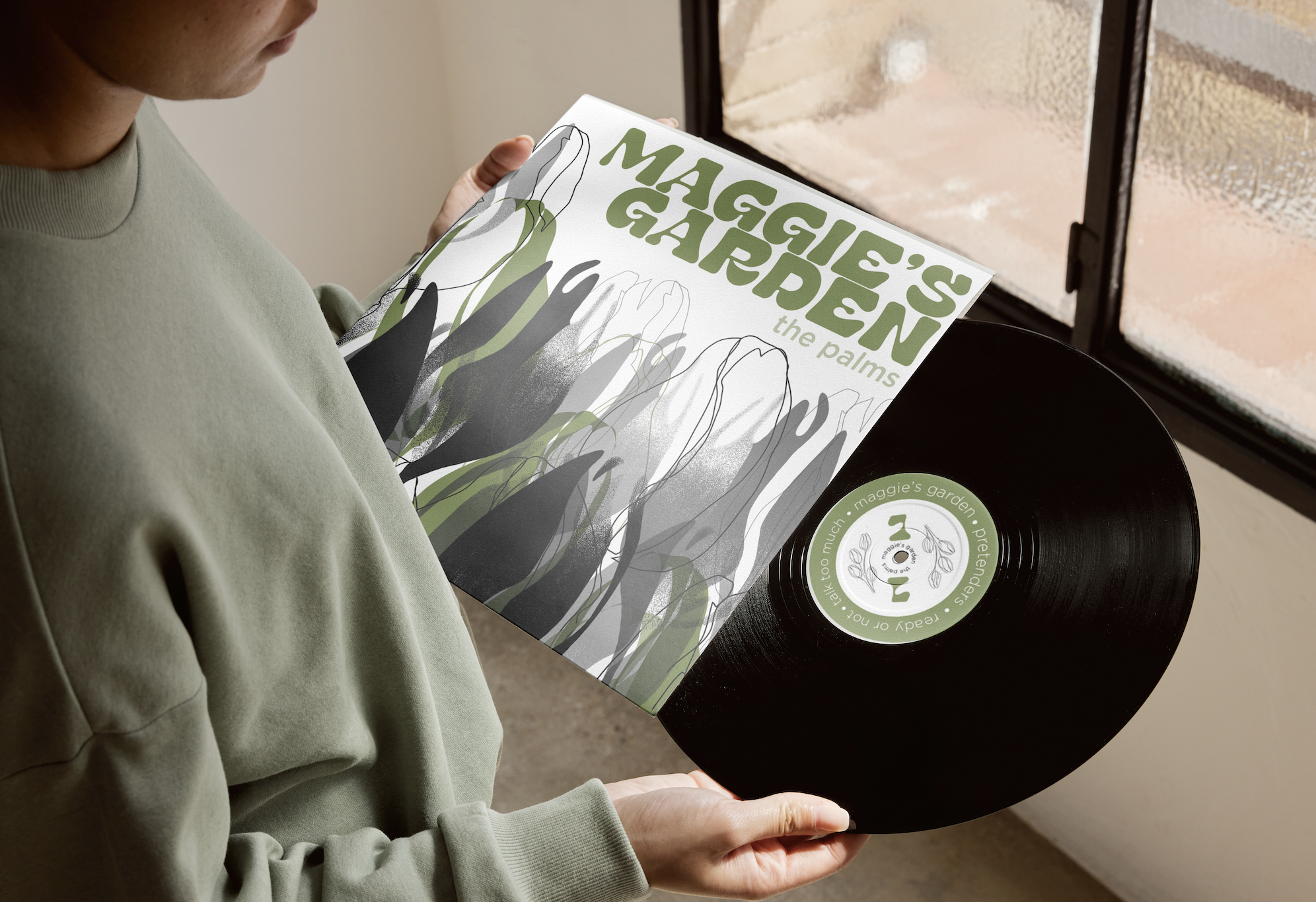
Each piece was created to work together as one system while incorporating different ambiguous elements. The stippled tulip design was crafted using procreate to add a stronger sense of ambiguity to the overall design. Using different variations of filled, outlined, and stippled tulips of all different values and colors, the design came together as a captivating piece that draws the eye in, yet challenges the brain. The typeface “Stora” was chosen to keep a sleek and clean look while “Gotham” was chosen as the body. Both typefaces are used consistently on both the front and back cover of the album along with the album labels. The zoetrope was systematically designed using the same stippling technique as the cover along with an illusion of a butterfly fluttering around the center of the vinyl. The album labels are intentionally the same layout in different colors so that they still work together in the system yet have different qualities to differentiate the two sides. Finally, the green color was chosen to add a slight pop against the overarching greyscale in the overall design and was integrated throughout each part of the series. All these elements work together to contribute to the style and flow of the project as a whole.


