World Heritage Site 224

Artist Statement
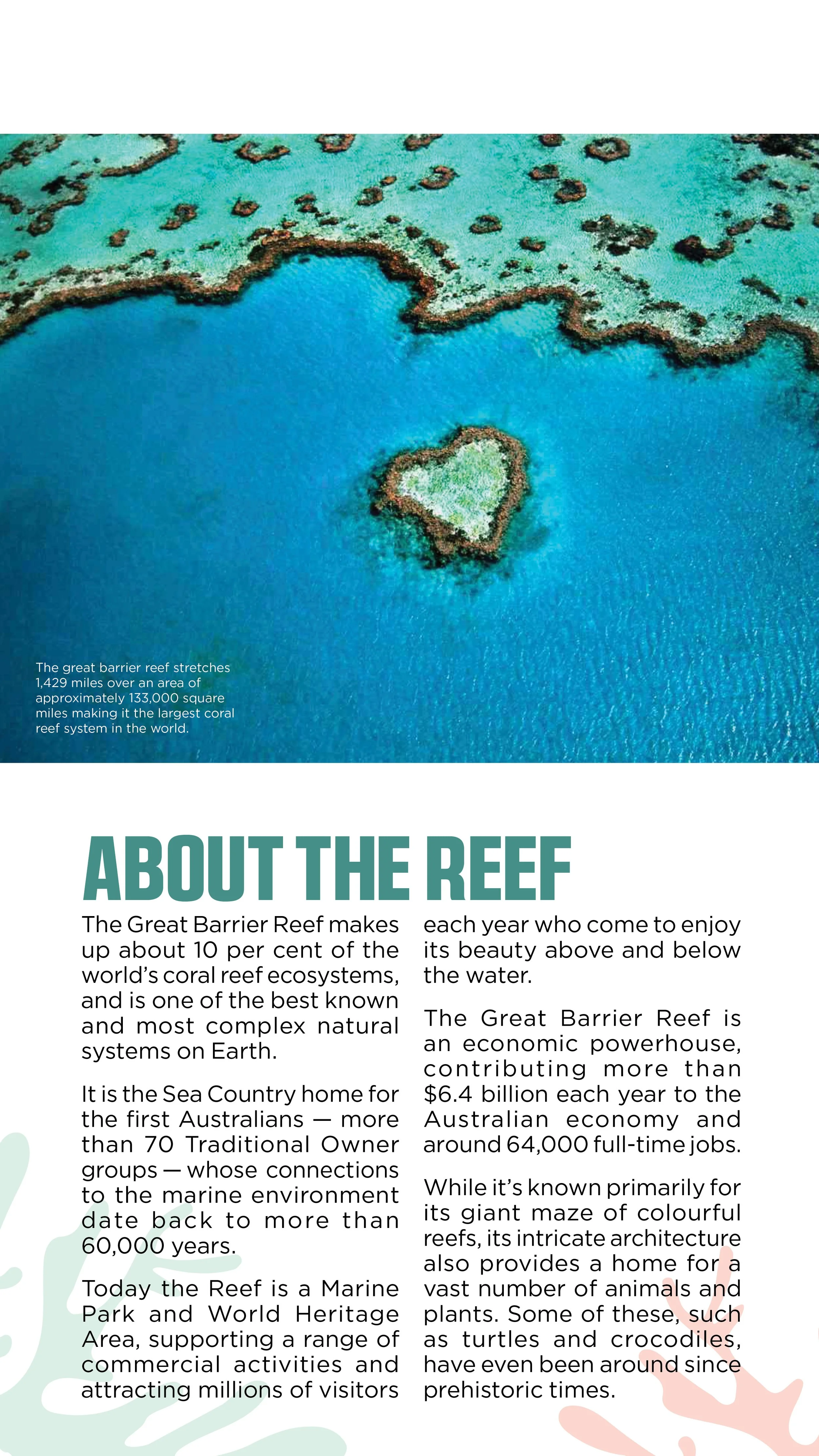
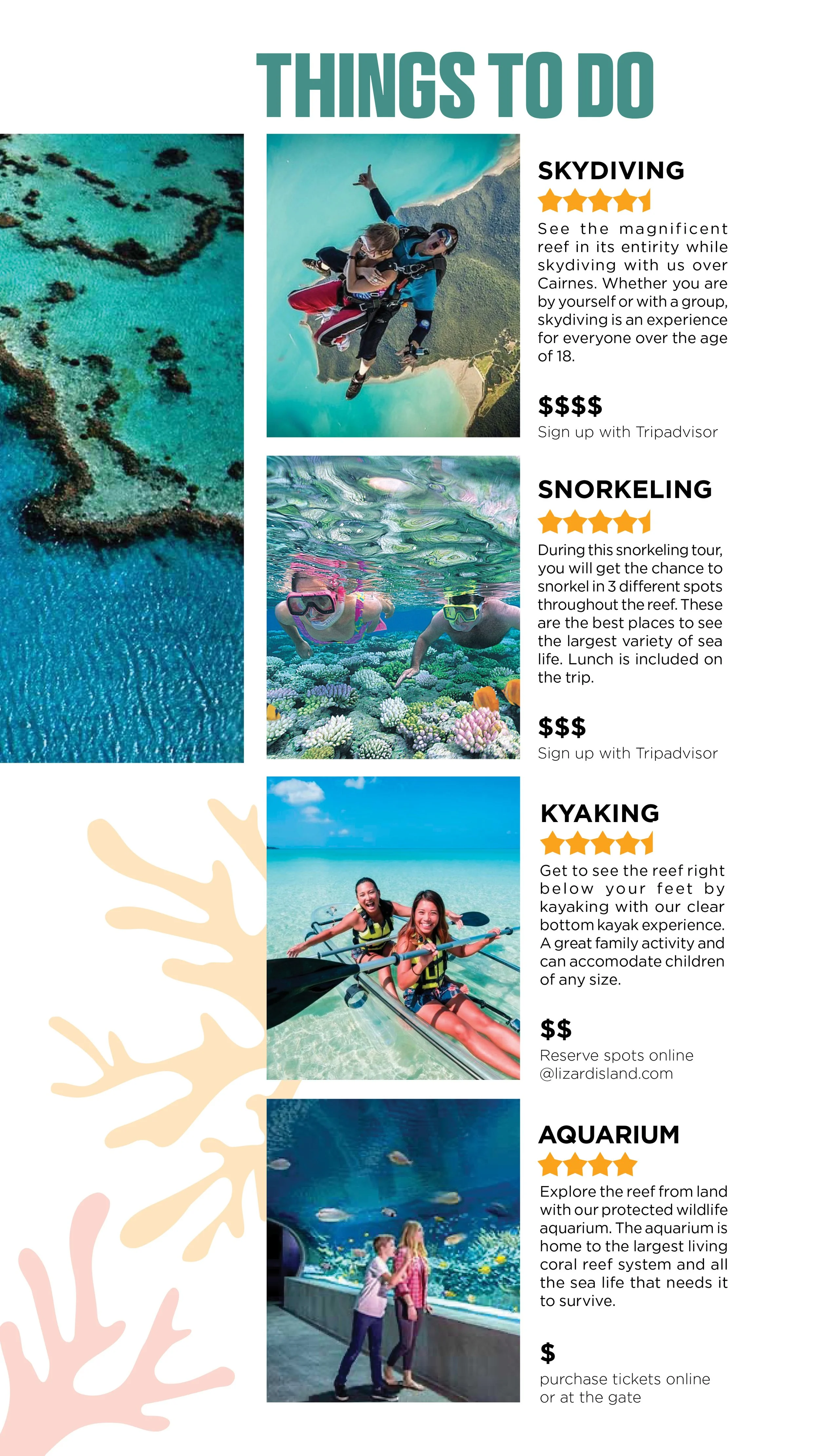
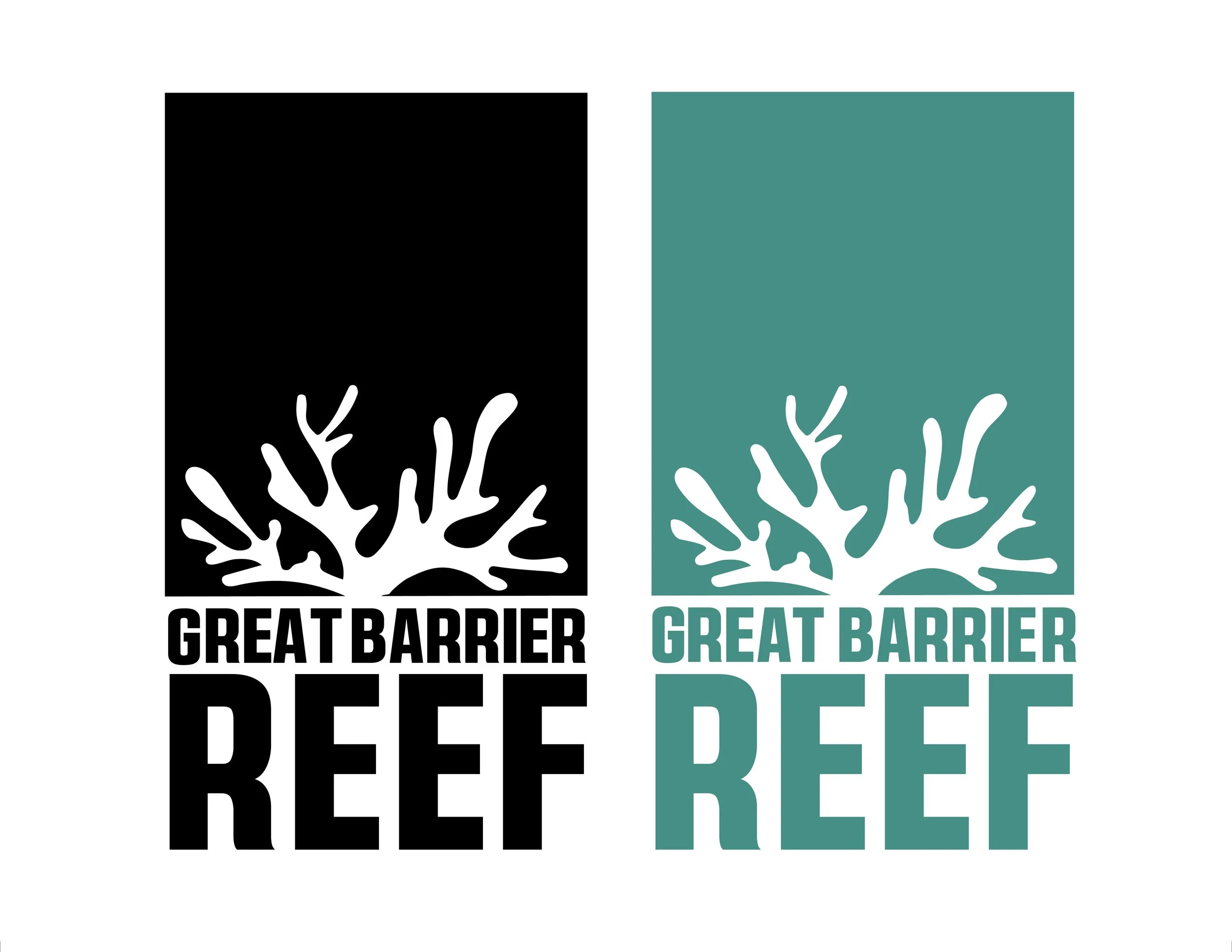
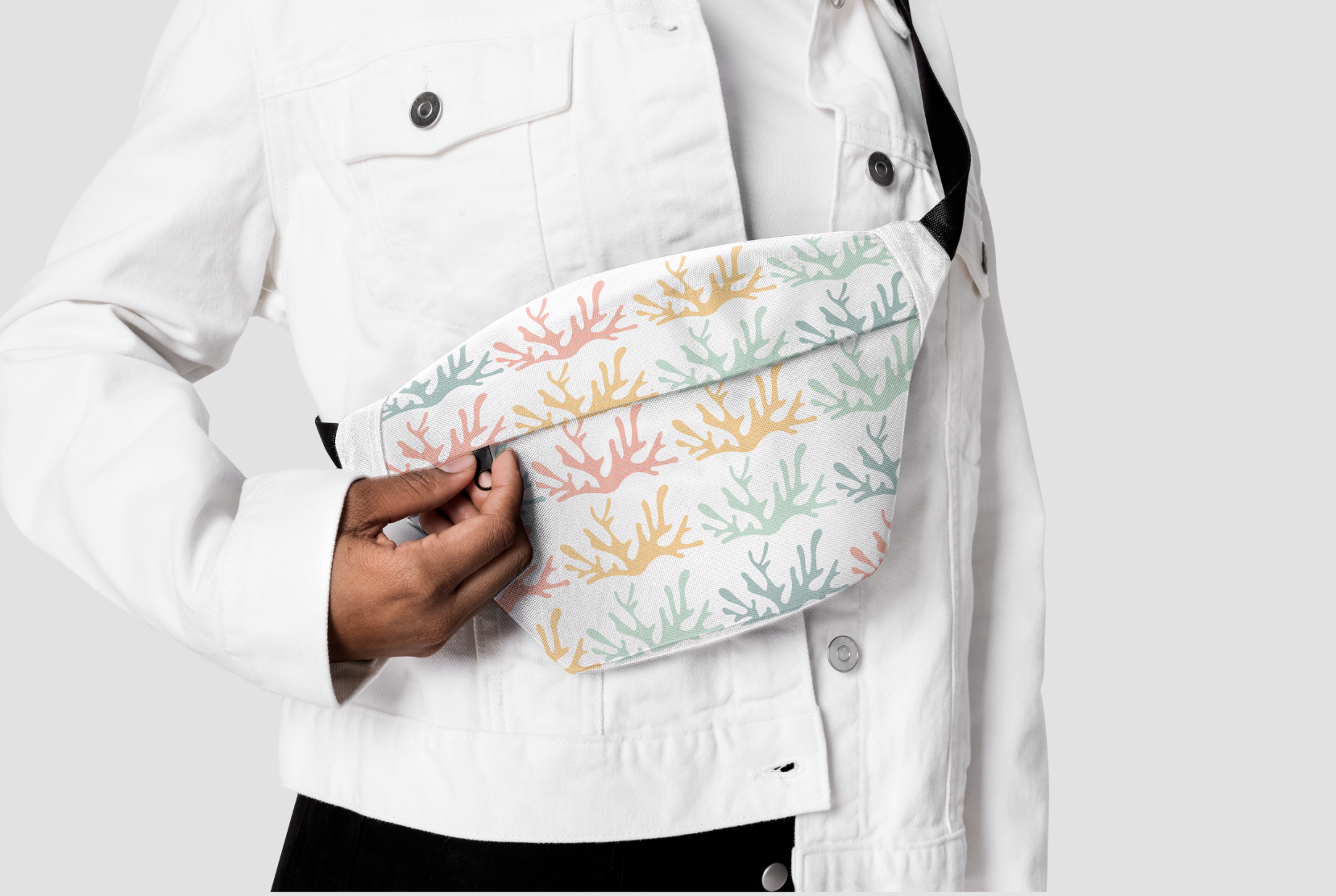
Inspired by the intricate reef system that makes up the Great Barrier Reef, the logo design is centered around a standard piece of coral that plays with background and foreground using color. The typeface “Avilock Bold” was chosen because of its bold symmetrical shape to complement the simplistic imagery in the logo. It also is intended to stand as the top level of hierarchy next to “Gotham Book” and “Gotham Light”. Integrating the logo into the brochure and choosing to fill the background of the logo using an image of coral gives the viewer a better visual representation of the Great Barrier Reef and adds a sense of intrigue to the cover page. The use of color, typefaces, and imagery are key to creating a successful system not only in the brochure but also in the stationery set. Throughout all the elements, there is repeated use of the same coral shape displayed in the logo. Patterns were made using this shape along with the designated color scheme. The color scheme was chosen to resemble the vast variety of color that is seen throughout the entirety of the reef and the sea life surrounding it.


