Typography Poster 223

Artist Statement
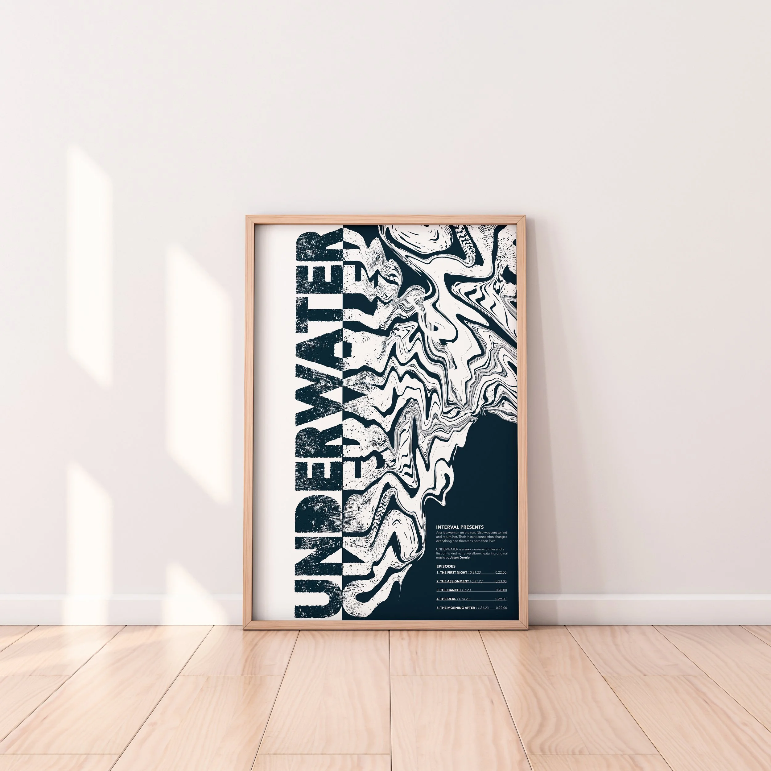
“UNDERWAY” was chosen as an intriguing typeface that contributes to the mystery of the podcast. “Avenir Next” was then chosen as the body typeface because it is sleek, legible and adds to the overall clean look of the poster. After compiling the fonts and typefaces, the manipulation was created to depict a reflection of the title on water. Using the liquify tool in photoshop to carefully drag out the typeface in a way that is still legible, made the overall manipulation successfully look like a ripple in the water. Making the title vertical rather than horizontal contributed to making the poster more interesting, and to push the hierarchy of the title in a different direction. The title was then made a significant amount larger so there would be a clear difference in the levels of hierarchy. Overall, the final product of the poster is simple yet captivating. The goal was to have minimal and cleanly organized text and to create a visually intriguing title to draw attention to the poster.


